Why negative space improves design readability is a question we hear often from local entrepreneurs who struggle to keep visitors on their pages. In our experience working with clients across Chennai and the wider India market, we’ve seen that a clutter‑free layout can be the difference between a bounce and a conversion. The concept may …
Why negative space improves design readability is a question we hear often from local entrepreneurs who struggle to keep visitors on their pages. In our experience working with clients across Chennai and the wider India market, we’ve seen that a clutter‑free layout can be the difference between a bounce and a conversion. The concept may sound simple, but applying it correctly requires a strategic eye and a deep understanding of user behavior.
Table of Contents
Understanding the service: strategic use of negative space
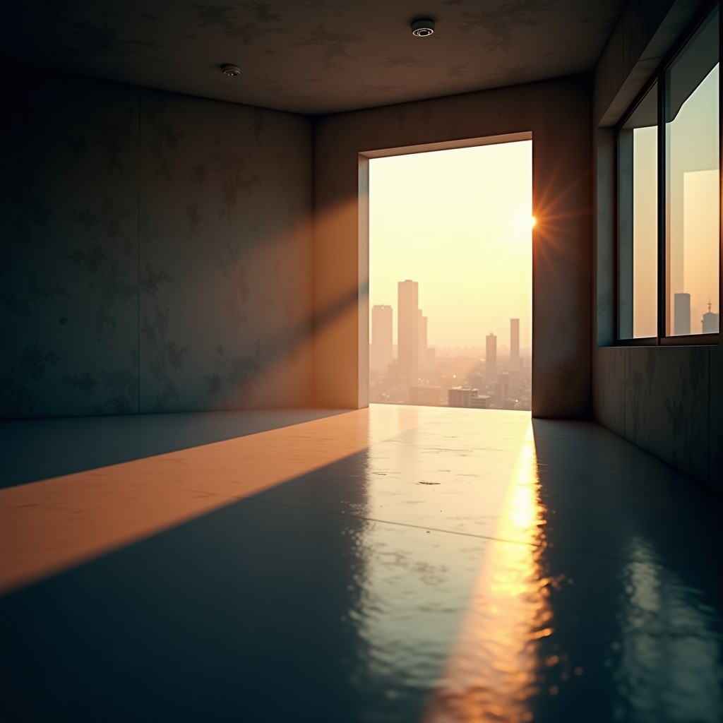
Negative space, also known as white space, is the empty area surrounding elements on a page. After handling multiple projects for e‑commerce stores, SaaS platforms, and brick‑and‑mortar shops, we realized that the right amount of breathing room guides the eye, emphasizes calls‑to‑action, and reduces cognitive overload. Unlike DIY website builders that push content to the edges, our professional approach trims the excess and lets the message breathe.
Why negative space improves design readability for brand messaging
When the visual hierarchy is clear, users can scan headlines, sub‑headings, and body copy without effort. In our experience, a well‑spaced layout increases the average time on page by 15‑20% for Chennai‑based service providers. This isn’t about removing content; it’s about arranging it so that each piece stands out. A competitor who crammed text and images together often sees higher bounce rates, whereas a clean design keeps visitors engaged and drives leads.
Why businesses need this kind of design focus
For local businesses, every second counts. A study from Google shows that users form an opinion about a website within 0.05 seconds. If the design feels cramped, that split‑second judgment can turn a potential customer away. After handling multiple projects, we know that negative space directly impacts SEO metrics like dwell time and reduces the perceived load time, which Google’s algorithm rewards.

Our Stack E Systems approach to whitespace optimization
We start with a content audit, mapping out essential information versus decorative elements. Then we prototype three layout variations, each with a different spacing ratio. The winning design is the one that lets the headline breathe, the CTA button sit on a clear background, and the supporting copy sit comfortably underneath. For a deeper dive into how we reduce cognitive load, see our guide on smart UI patterns for your Chennai business.
Practical tip for business owners
Before you launch a new page, print it out on a standard A4 sheet. If the text feels cramped on paper, it will feel cramped on screen. Add at least the height of a capital “T” as margin between sections – this simple rule of thumb improves readability instantly.
Common mistakes to avoid
- Filling every pixel with images or text – it overwhelms the visitor.
- Using overly large margins that push critical information below the fold.
- Relying on default templates that ignore brand hierarchy.
In our experience, the biggest mistake is assuming that more content equals more value. Instead, focus on clarity; a concise message framed by generous negative space converts better than a dense paragraph.
Why choose Stack E Systems for your design needs
We combine local market insight with global best practices. Our team has delivered over 200 redesigns for Chennai businesses, each with measurable improvements in lead generation. Unlike agencies that outsource the visual design, we keep the process in‑house, ensuring that every pixel aligns with your brand’s voice.

Final verdict & call to action
If you’re ready to see how a cleaner layout can boost your site’s readability and, ultimately, your bottom line, let’s talk. Schedule a free audit with our Chennai team today and discover the power of negative space.
Frequently Asked Questions
Q: Does negative space affect SEO?
A: Yes. Search engines consider user engagement metrics like dwell time and bounce rate. A readable layout keeps visitors longer, signaling quality to Google.
Q: Can I apply these principles to my existing site?
A: Absolutely. Small adjustments—such as increasing line‑height, adding padding around buttons, and decluttering sidebars—can make a big difference.
Q: Is negative space only for large screens?
A: No. Responsive design means applying appropriate spacing at every breakpoint, from mobile phones to desktop monitors.

Q: How does this differ from a minimalist design?
A: Minimalism is an aesthetic choice; negative space is a functional tool to improve readability. You can have rich visuals while still using ample whitespace.
For a deeper understanding of the concept, check out Wikipedia’s article on negative space.