Website Typography Mistakes to Avoid: Boost Your Search Engine Rankings with Well-Crafted Typography As a business owner in Chennai, you understand the importance of having a professional online presence. Your website is often the first impression that potential customers have of your brand, and a well-designed website can make all the difference. One crucial aspect …
Website Typography Mistakes to Avoid: Boost Your Search Engine Rankings with Well-Crafted Typography
As a business owner in Chennai, you understand the importance of having a professional online presence. Your website is often the first impression that potential customers have of your brand, and a well-designed website can make all the difference. One crucial aspect of website design is typography, which can make or break the user experience. In this blog post, we’ll explore the most common website typography mistakes to avoid and provide expert tips on how to improve your website’s typography to boost your search engine rankings.
Typography: The Unsung Hero of Website Design
Typography is often overlooked as a critical aspect of website design, but it plays a significant role in how users perceive your brand. Good typography can enhance the readability, usability, and overall aesthetic appeal of your website, while poor typography can lead to a negative user experience. In fact, according to a study by Adobe, 95% of users say they would not use a website again if it had poor typography.
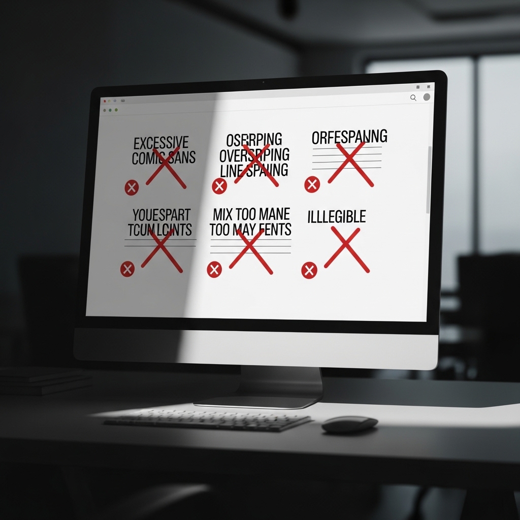
Mistake #1: Inconsistent Font Usage
Using multiple fonts on your website can create a visually unappealing experience for users. It’s essential to choose a few fonts that work well together and stick to them throughout your website. For example, you can use a serif font for headings and a sans-serif font for body text.
Mistake #2: Font Sizes that are Too Small or Too Large
Using font sizes that are too small or too large can make your content difficult to read. Aim for a font size between 12px and 18px for body text, and adjust the size according to the context. For example, headings can be larger than body text, but not so large that they overwhelm the content.
Mistake #3: Poor Line Spacing
Poor line spacing, also known as leading, can make your content appear cluttered and difficult to read. Ensure that you leave enough space between lines of text to make it easy for users to scan and read your content.
Mistake #4: Not Using Headings and Subheadings
Using headings and subheadings can help organize your content and make it easier for users to scan. This is especially important for long pieces of content, such as blog posts or articles.
Mistake #5: Not Using Font Styles
Font styles, such as italic or bold, can help draw attention to important information or create visual hierarchy on your website. Use font styles judiciously to add emphasis to specific words or phrases.
Mistake #6: Not Considering Font Families
Font families refer to the different styles and weights of a font. Using a font family can create a cohesive look and feel on your website, while using multiple font families can create visual dissonance.
Mistake #7: Not Testing Your Typography
Before launching your website, test your typography to ensure that it’s readable and visually appealing. Use tools such as Google Fonts or Font Awesome to test different font combinations and styles.
Frequently Asked Questions
Q: What are some good font combinations for a website?
A: Some good font combinations for a website include serif and sans-serif fonts, such as Merriweather and Open Sans, or Georgia and Arial.
Q: How can I improve the readability of my website’s typography?
A: To improve the readability of your website’s typography, ensure that you use a clear and consistent font, with adequate line spacing and font sizes.
Q: What are some good resources for finding free fonts?
A: Some good resources for finding free fonts include Google Fonts, Font Awesome, and DaFont.
Conclusion
In conclusion, typography is a critical aspect of website design that can make or break the user experience. By avoiding common typography mistakes and using best practices, you can create a website that is both visually appealing and easy to read. Remember to choose a few fonts that work well together, use font sizes and styles judiciously, and test your typography before launching your website.
Take Action
To improve your website’s typography, start by identifying and correcting any common typography mistakes. Then, experiment with different font combinations and styles to find a look that works for your brand. Finally, test your typography to ensure that it’s readable and visually appealing.
At STACK E SYSTEMS, we specialize in creating high-ranking, search engine-focused content that drives results for businesses in Chennai. Contact us today to learn more about our services and how we can help you improve your website’s typography and search engine rankings.
Additional Resources
- Why Your Website Needs High-Quality Images: https://stackesystems.in/why-your-website-needs-high-quality-images/
- How to Rank for Local Keywords in Chennai: https://stackesystems.in/how-to-rank-for-local-keywords-in-chennai/
- Everything About Backlinks for Chennai Businesses: https://stackesystems.in/everything-about-backlinks-for-chennai-businesses/
Get in Touch
If you have any questions or would like to learn more about our services, please don’t hesitate to contact us. You can reach us by phone at 9445210058 or by email at [email protected].