Top Responsive Design Practices for 2025: Elevate Your Online Presence in Chennai As a business owner in Chennai, you understand the importance of having a website that resonates with your target audience. With the proliferation of mobile devices and the increasing demand for seamless user experiences, responsive design has become a crucial aspect of digital …
Top Responsive Design Practices for 2025: Elevate Your Online Presence in Chennai
As a business owner in Chennai, you understand the importance of having a website that resonates with your target audience. With the proliferation of mobile devices and the increasing demand for seamless user experiences, responsive design has become a crucial aspect of digital marketing. In this article, we’ll explore the top responsive design practices for 2025, helping you create a website that not only looks great but also performs exceptionally well.
Understanding Responsive Design
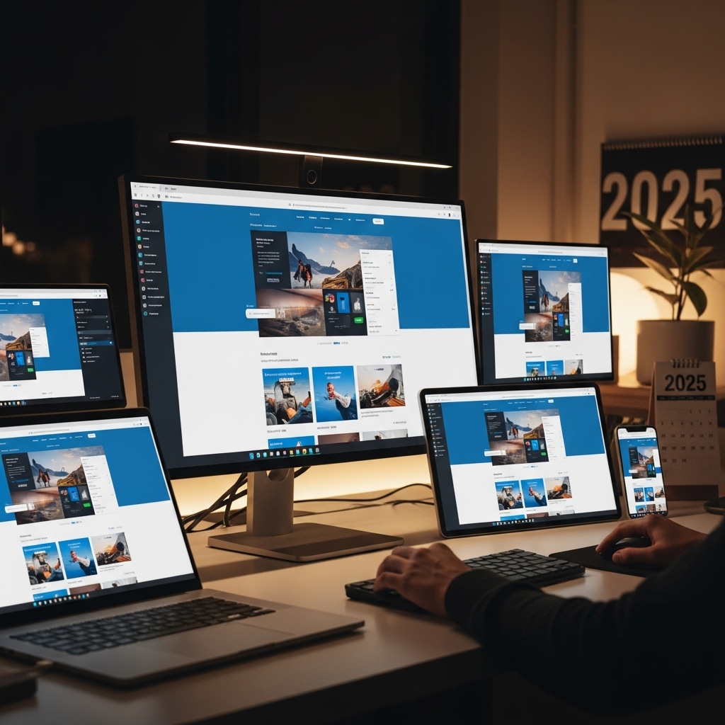
Responsive design is an approach to web development that focuses on creating a website that adapts to different screen sizes, devices, and orientations. This means that your website should look and function optimally on various devices, including desktops, laptops, tablets, and smartphones. Responsive design is essential in today’s digital landscape, as it ensures that your website is accessible to a wider audience, improves user engagement, and enhances search engine rankings.
Top Responsive Design Practices for 2025
1. Mobile-First Design
In 2025, mobile-first design will continue to dominate the web development landscape. This approach involves designing for mobile devices first and then scaling up to larger screens. By prioritizing mobile users, you can ensure a faster, more intuitive, and more engaging experience.
- Tip: Use Stackesystems’ mobile-first design guide to create a website that caters to the needs of mobile users. [1]
- Tip: Use Stackesystems’ website accessibility guide for Chennai companies to learn more about using Flexbox and grid layouts for creating accessible websites. [2]
- Tip: Use image compression tools like TinyPNG or ImageOptim to reduce the file size of your images. [3]
- Tip: Use Stackesystems’ how-to guide on fixing indexing issues for Chennai websites to learn more about optimizing navigation and interactions for search engines. [4]
- Tip: Use Stackesystems’ website accessibility guide for Chennai companies to learn more about prioritizing content for users with disabilities.
- Tip: Use Stackesystems’ guide on how mobile speed impacts Chennai visitors to learn more about optimizing media queries for faster page load times.
2. Flexbox and Grid Layouts
Flexbox and grid layouts are powerful tools for creating responsive designs. These layouts allow you to easily manage and arrange content, ensuring that it adapts to different screen sizes and devices.
3. Image Optimization
Images are a crucial aspect of responsive design. Optimizing images for different devices and screen sizes can significantly improve page load times and user experience.
4. Responsiveness in Navigation and Interactions
Responsiveness is not limited to visual design; it also applies to navigation and interactions. Ensure that your website’s navigation, buttons, and forms are designed to work seamlessly across different devices and screen sizes.
5. Content Prioritization
Prioritize content by focusing on the most important elements and hiding or condensing less important content. This approach ensures that users can easily access the information they need, regardless of their device or screen size.
6. Media Queries
Media queries are an essential aspect of responsive design. These queries allow you to apply different styles and layouts based on different screen sizes, devices, and orientations.
Frequently Asked Questions
1. What is the difference between responsive design and mobile design?
Responsive design is an approach that focuses on creating a website that adapts to different screen sizes, devices, and orientations, whereas mobile design is a specific design approach that caters to mobile devices.
2. Is responsive design necessary for my Chennai-based business?
Yes, responsive design is essential for any business in Chennai, as it ensures that your website is accessible to a wider audience, improves user engagement, and enhances search engine rankings.
3. Can I use responsive design for my e-commerce website?
Yes, responsive design is highly effective for e-commerce websites, as it ensures that users can easily navigate and make purchases on different devices and screen sizes.
Conclusion
In conclusion, responsive design is a critical aspect of digital marketing in 2025. By implementing the top responsive design practices outlined in this article, you can create a website that not only looks great but also performs exceptionally well. Remember to prioritize mobile-first design, use Flexbox and grid layouts, optimize images, and focus on responsiveness in navigation and interactions. By following these best practices, you can elevate your online presence in Chennai and attract more users to your website.
Get in Touch
If you’re looking to create a responsive website for your Chennai-based business, Stackesystems is here to help. Our team of experts provides professional web development services, ensuring that your website is optimized for search engines and user-friendly. Contact us today at 9445210058 or visit our website at stackesystems.in.
References:
[1] Stackesystems’ Mobile-First Design Guide: https://stackesystems.in/mobile-first-design-guide/
[2] Stackesystems’ Website Accessibility Guide for Chennai Companies: https://stackesystems.in/website-accessibility-guide-for-chennai-companies/
[3] TinyPNG: https://tinypng.com/
[4] Stackesystems’ Fixing Indexing Issues for Chennai Websites: https://stackesystems.in/fixing-indexing-issues-for-chennai-websites-2/
