Navigation Menu Trends for 2025: A Guide to Enhance User Experience As we step into the new year, the world of web design is evolving at an unprecedented pace. With the rise of user-centric design, navigation menus have become a crucial aspect of any website's success. A well-designed navigation menu can make or break the …
Navigation Menu Trends for 2025: A Guide to Enhance User Experience
As we step into the new year, the world of web design is evolving at an unprecedented pace. With the rise of user-centric design, navigation menus have become a crucial aspect of any website’s success. A well-designed navigation menu can make or break the user experience, and 2025 is no exception. In this comprehensive guide, we’ll explore the latest navigation menu trends that will shape the future of web design.
The Importance of Navigation Menus
Before we dive into the trends, let’s understand the significance of navigation menus. A navigation menu is the backbone of any website, providing users with a clear path to explore and find what they’re looking for. A poorly designed menu can lead to frustration, increased bounce rates, and a decreased conversion rate. On the other hand, a well-designed menu can enhance user engagement, increase conversions, and drive business growth.
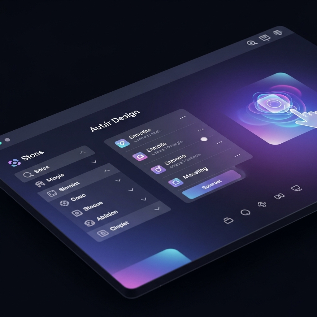
Trend 1: Minimalist Design
Minimalism is on the rise, and navigation menus are no exception. In 2025, expect to see more minimalist designs that prioritize simplicity and ease of use. This trend is all about stripping away unnecessary elements and focusing on the essentials. A minimalist navigation menu should be clean, intuitive, and easy to navigate.
Trend 2: Custom Illustrations
Custom illustrations are becoming increasingly popular in web design, and navigation menus are no exception. This trend involves using custom illustrations to create a unique and memorable user experience. From hand-drawn icons to custom illustrations, this trend is all about adding a personal touch to your navigation menu.
Trend 3: Sticky Navigation
Sticky navigation menus are on the rise, and for good reason. This trend involves creating a navigation menu that sticks to the top or bottom of the screen as users scroll. This design element provides users with a constant point of reference, making it easier to navigate the website.
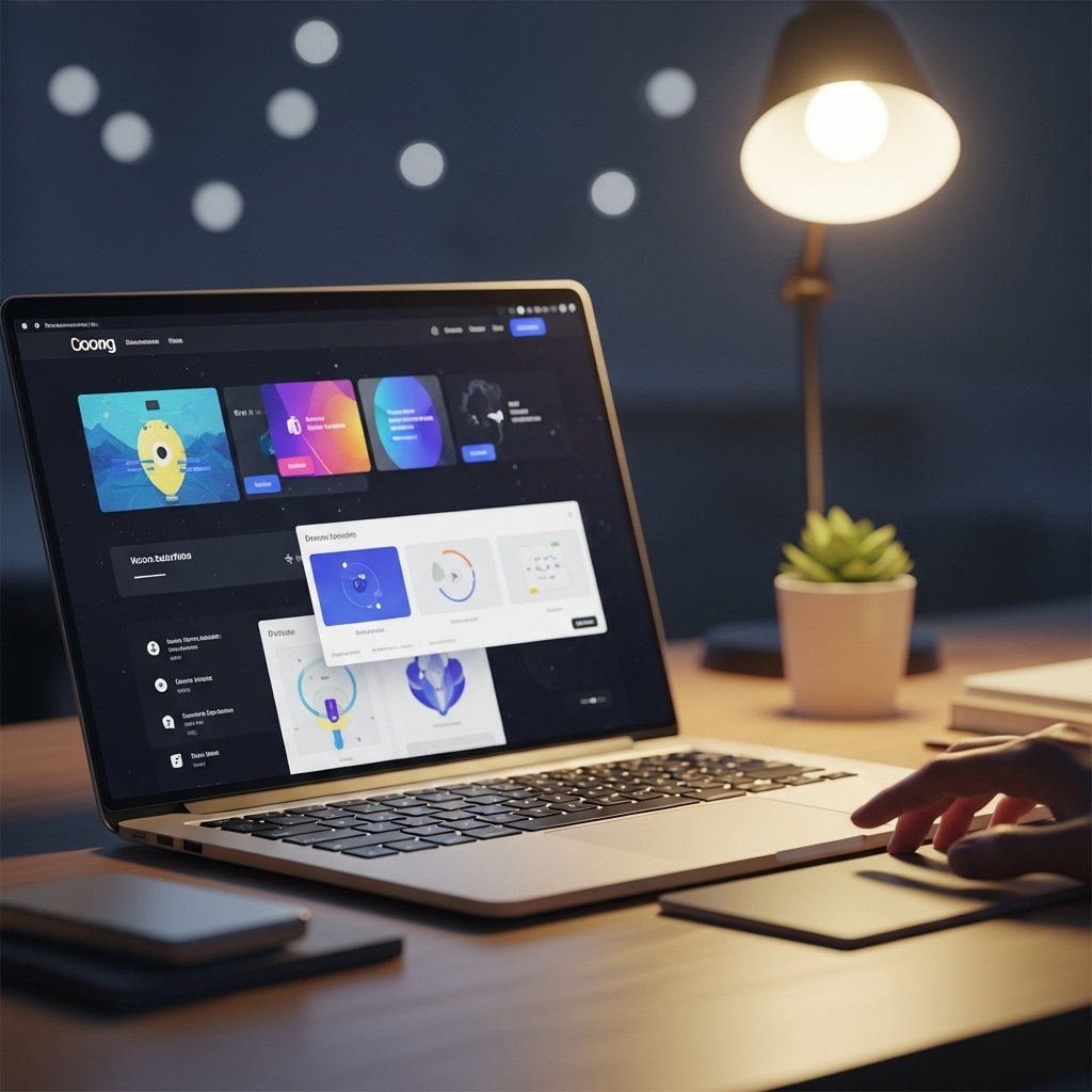
Trend 4: Responsive Design
Responsive design is no longer a trend, but a necessity. In 2025, expect to see navigation menus that adapt seamlessly to different devices and screen sizes. This trend involves designing menus that are flexible, scalable, and easy to use on any device.
Trend 5: Micro-Interactions
Micro-interactions are small design elements that provide users with a tactile experience. In 2025, expect to see more micro-interactions in navigation menus, such as animations, hover effects, and scrolling transitions. These design elements can enhance user engagement and provide a more immersive experience.
Trend 6: Accessibility
Accessibility is becoming increasingly important in web design, and navigation menus are no exception. In 2025, expect to see more navigation menus that prioritize accessibility, including features such as screen reader compatibility, high contrast modes, and keyboard-navigable menus.
Trend 7: Animated Navigation
Animated navigation menus are on the rise, and for good reason. This trend involves using animations to create a dynamic and engaging user experience. From sliding menus to animated icons, this trend is all about adding a touch of personality to your navigation menu.
Trend 8: Multi-Level Navigation
Multi-level navigation menus are becoming increasingly popular, especially in e-commerce websites. This trend involves creating a navigation menu that allows users to drill down to specific categories and subcategories. This design element provides users with a more detailed and organized shopping experience.
Frequently Asked Questions
Q: What is the most important aspect of navigation menu design?
A: The most important aspect of navigation menu design is simplicity and ease of use. A navigation menu should be easy to navigate and provide users with a clear path to find what they’re looking for.
Q: How can I ensure my navigation menu is accessible?
A: To ensure your navigation menu is accessible, prioritize features such as screen reader compatibility, high contrast modes, and keyboard-navigable menus.
Q: What is the best way to design a responsive navigation menu?
A: The best way to design a responsive navigation menu is to use a flexible and scalable design that adapts seamlessly to different devices and screen sizes.
Conclusion
As we look to the future of web design, it’s clear that navigation menus will continue to play a crucial role in enhancing user experience. By incorporating the latest trends and best practices, you can create a navigation menu that drives engagement, conversions, and business growth. Remember to prioritize simplicity, accessibility, and responsiveness, and don’t be afraid to experiment with new design elements and micro-interactions.
At STACK E SYSTEMS, we specialize in creating custom web design solutions that prioritize user experience. Whether you’re looking to revamp your existing website or build a new one from scratch, our team of experts is here to help. Contact us today to learn more about our services and how we can help you achieve your web design goals.
Get in touch with us:
Phone: 9445210058
Email: [email protected]
Website: stackesystems.in
Related Resources:
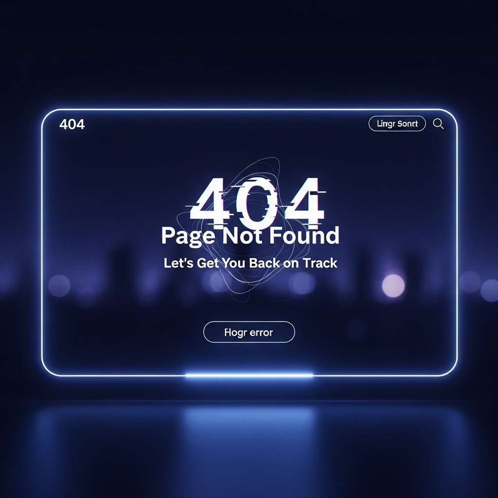
- 404 Page Design Ideas That Convert: https://stackesystems.in/404-page-design-ideas-that-convert/
- How to Build a Portfolio for Web Leads: https://stackesystems.in/how-to-build-a-portfolio-for-web-leads/
- Best Web Design Examples for Chennai Interior Designers: https://stackesystems.in/best-web-design-examples-for-chennai-interior-designers/
