Creating a Site That Passes Google’s Mobile-First Index: A Comprehensive Guide As a business owner in [City, State], you're likely aware of the importance of having a website that ranks high in search engine results pages (SERPs). But with the ever-changing landscape of search engine algorithms, it can be challenging to keep up with the …
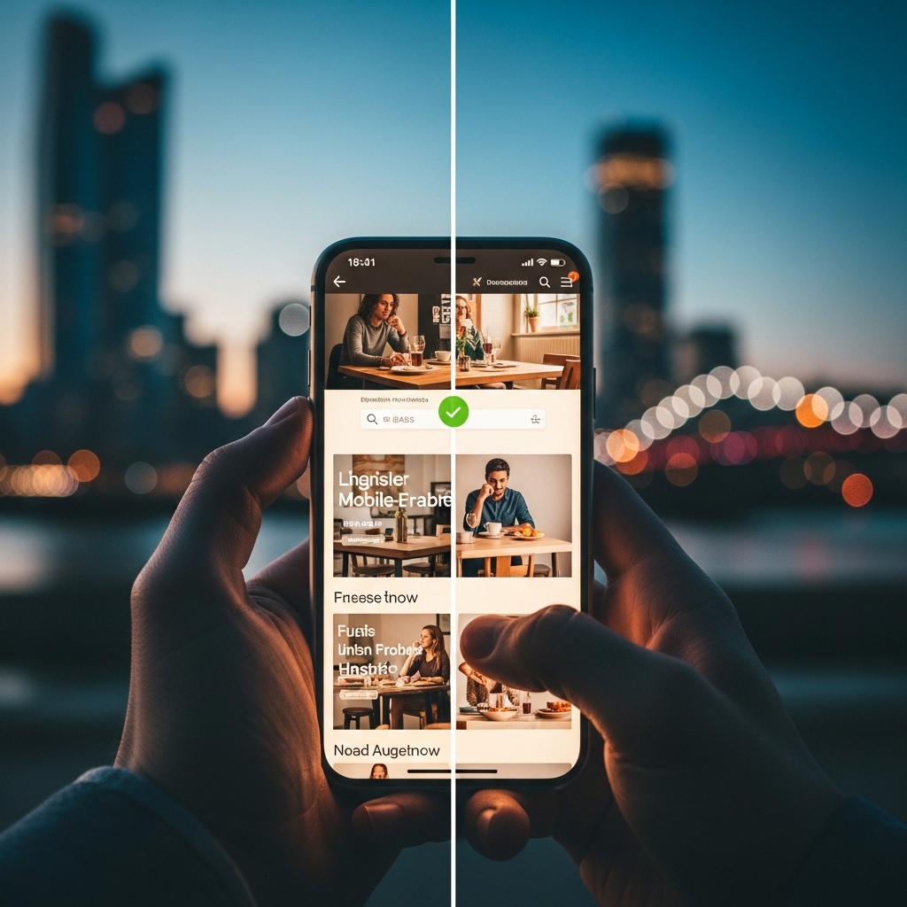
Creating a Site That Passes Google’s Mobile-First Index: A Comprehensive Guide
As a business owner in [City, State], you’re likely aware of the importance of having a website that ranks high in search engine results pages (SERPs). But with the ever-changing landscape of search engine algorithms, it can be challenging to keep up with the latest best practices. One of the most significant updates in recent years is Google’s shift to a mobile-first index. If your website isn’t optimized for mobile devices, you’re at risk of falling behind the competition.
In this comprehensive guide, we’ll walk you through the process of creating a site that passes Google’s mobile-first index. By the end of this article, you’ll have a solid understanding of what it takes to create a mobile-friendly website that attracts and engages with your target audience.
What is a Mobile-First Index?
In the past, Google used to crawl and index websites based on their desktop versions. However, with the increasing adoption of mobile devices, Google realized that most users access the internet on their smartphones. As a result, they introduced the mobile-first index, which prioritizes the mobile version of a website over the desktop version.
Why is Mobile-First Index Important?
There are several reasons why a mobile-first index is crucial for your website:
1. User Experience: A mobile-friendly website provides a seamless user experience, allowing users to easily navigate and interact with your content on their mobile devices.
2. Search Engine Rankings: Google favors mobile-friendly websites in its search engine rankings, making it more likely for your website to appear at the top of search results.
3. Conversion Rates: A mobile-friendly website can lead to higher conversion rates, as users are more likely to complete transactions or fill out forms on their mobile devices.
How to Create a Site That Passes Google’s Mobile-First Index
Creating a mobile-first index-friendly website requires a combination of technical and design expertise. Here are some steps to help you get started:
1. Ensure Your Website is Responsive
A responsive website adapts to different screen sizes and devices, providing an optimal viewing experience for users. You can achieve this by using a responsive design framework or by implementing a responsive design on your website.
2. Use a Mobile-Friendly Template
Choose a template that is specifically designed for mobile devices. This will ensure that your website’s layout, typography, and imagery are optimized for mobile screens.
3. Optimize Your Content
Optimize your content for mobile devices by:
- Using clear and concise language
- Breaking up long paragraphs into shorter ones
- Using headings and subheadings
- Including high-quality images and videos
- Using a content delivery network (CDN)
- Compressing your images
- Minifying your code
- Use a single URL for both mobile and desktop versions: This will help search engines crawl and index your website more efficiently.
- Use the viewport meta tag: This tag helps search engines understand how to scale and render your website on different devices.
- Use a mobile-friendly navigation menu: A mobile-friendly navigation menu should be easy to use and provide quick access to your website’s most important pages.
- Optimize your website’s images: Optimize your website’s images by compressing them and using responsive image formats such as WebP and AVIF.
- Best Image Formats for Web: WebP, AVIF & When to Use Them: https://stackesystems.in/best-image-formats-for-web-webp-avif-when-to-use-them/
- How to Make an SEO-Ready Portfolio Page: https://stackesystems.in/how-to-make-an-seo-ready-portfolio-page/
- API Integrations Every Modern Business Website Needs: https://stackesystems.in/api-integrations-every-modern-business-website-needs/
4. Prioritize Content Above the Fold
Above-the-fold content refers to the content that is visible on a user’s screen without scrolling. Prioritize your most important content above the fold to ensure that users can easily access it on their mobile devices.
5. Use Touch-Friendly Elements
Use touch-friendly elements such as buttons, forms, and links to make it easy for users to interact with your website on their mobile devices.
6. Optimize Your Website’s Speed
A slow-loading website can be frustrating for users, especially on mobile devices. Optimize your website’s speed by:
7. Test Your Website on Different Devices
Test your website on different devices and platforms to ensure that it is functioning as expected. This will help you identify any technical issues or design flaws that may affect the user experience.
Best Practices for Mobile-First Index Optimization
Here are some additional best practices to help you optimize your website for mobile-first index:
Frequently Asked Questions
Here are some frequently asked questions about mobile-first index optimization:
Q: What is the difference between mobile-first and responsive design?
A: Mobile-first design refers to designing a website specifically for mobile devices, while responsive design refers to designing a website that adapts to different screen sizes and devices.
Q: How do I test my website for mobile-first index optimization?
A: You can test your website for mobile-first index optimization by using tools such as Google’s Mobile-Friendly Test or by testing your website on different devices and platforms.
Q: Can I still use my existing website without making changes?
A: While it’s possible to use your existing website without making changes, it’s not recommended. A mobile-first index-friendly website provides a better user experience and is more likely to rank higher in search engine results.
Conclusion
Creating a site that passes Google’s mobile-first index requires a combination of technical and design expertise. By following the steps outlined in this guide, you can create a mobile-friendly website that provides a seamless user experience and improves your search engine rankings.
Remember to prioritize content above the fold, use touch-friendly elements, and optimize your website’s speed. Test your website on different devices and platforms to ensure that it is functioning as expected.
Get in Touch
If you’re looking for help with mobile-first index optimization or need assistance with designing a mobile-friendly website, contact STACK E SYSTEMS today. Our team of experts can help you create a website that attracts and engages with your target audience.
Additional Resources
Contact Information
Phone: 9445210058
Email: [email protected]
Website: https://stackesystems.in
Author Bio
[Your Name] is a seasoned SEO expert with years of experience in creating high-ranking, search engine-focused content. With a passion for staying up-to-date with the latest search engine algorithms and best practices, [Your Name] is dedicated to helping businesses create websites that attract and engage with their target audience.