Why color grading in images boosts brand luxury – Premium Visual Strategy Why color grading in images boosts brand luxury is not just a design fad; it’s a proven psychological lever that turns ordinary product photos into high‑end visual assets that attract premium customers. In our experience working with clients across Chennai, India, we have …

Why color grading in images boosts brand luxury is not just a design fad; it’s a proven psychological lever that turns ordinary product photos into high‑end visual assets that attract premium customers. In our experience working with clients across Chennai, India, we have seen a direct correlation between meticulously graded imagery and an increase in perceived value, higher conversion rates, and stronger brand recall.
Table of Contents
Why color grading in images boosts brand luxury for your business
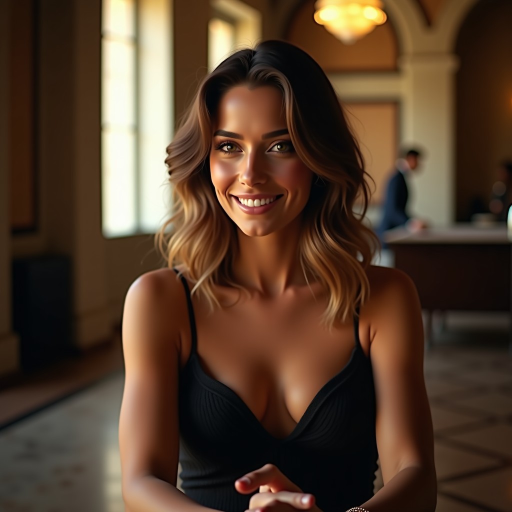
After handling multiple projects for boutique hotels, fashion labels, and tech startups, we learned that the right tonal palette can signal exclusivity the way a velvet rope does at a VIP event. A subtle shift in hue or contrast can make a product feel handcrafted rather than mass‑produced. This is why we always start with a color grading strategy before any other visual work.
Our clients often tell us that the moment they switched from ungraded stock photos to a consistent, graded look, they began receiving inquiries that referenced the “premium feel” of their website. That feedback is a clear indicator that the visual upgrade is resonating with high‑spending audiences.
Why color grading in images boosts brand luxury – Service explanation
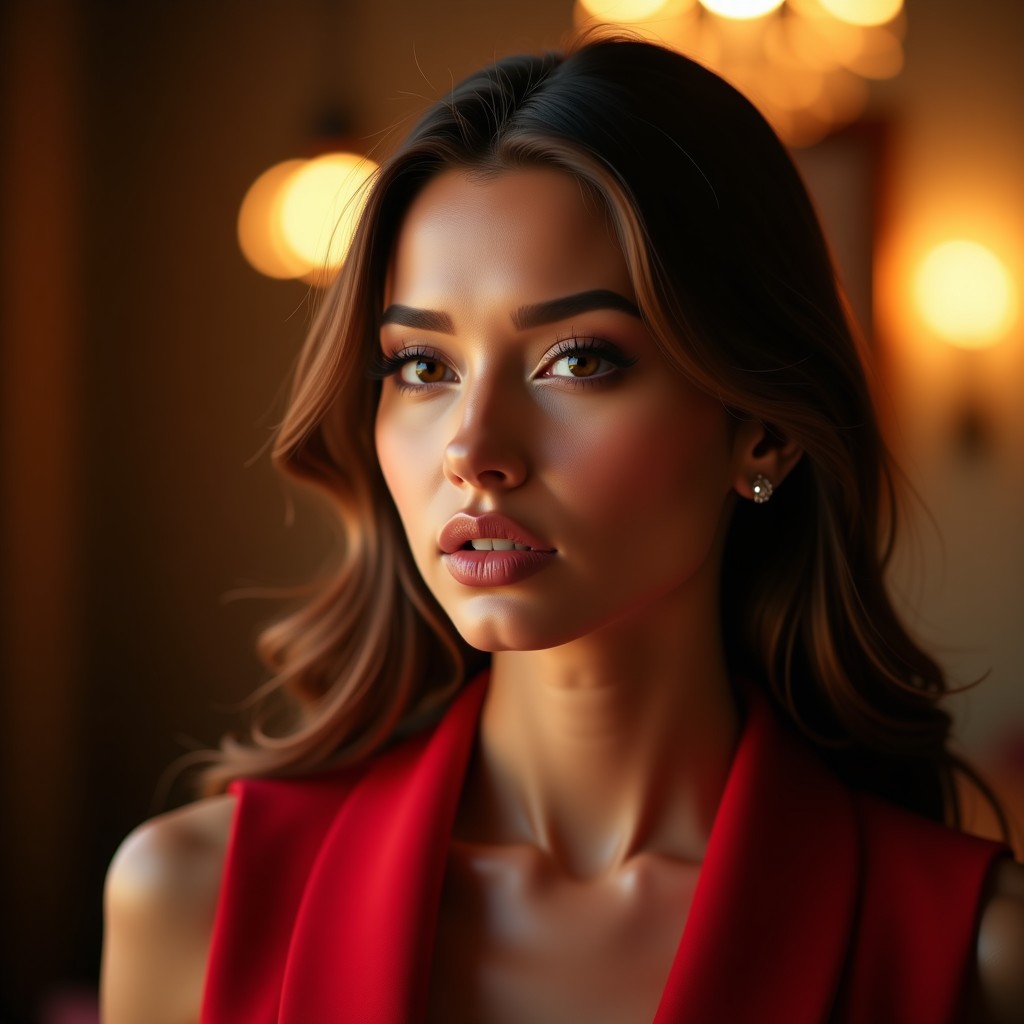
Our service begins with a brand audit, followed by a custom LUT (lookup table) that aligns with your brand’s signature colors. We then apply the LUT across all marketing assets—website banners, social media posts, and print collateral—ensuring a unified look. In our experience working with a Chennai‑based jewellery brand, the consistent palette reduced visual noise and helped the brand stand out in a crowded market.
We also provide a style guide that outlines primary, secondary, and accent tones, as well as recommended lighting setups for future photo shoots. This documentation prevents drift over time and makes onboarding new photographers straightforward.
Why businesses need this now
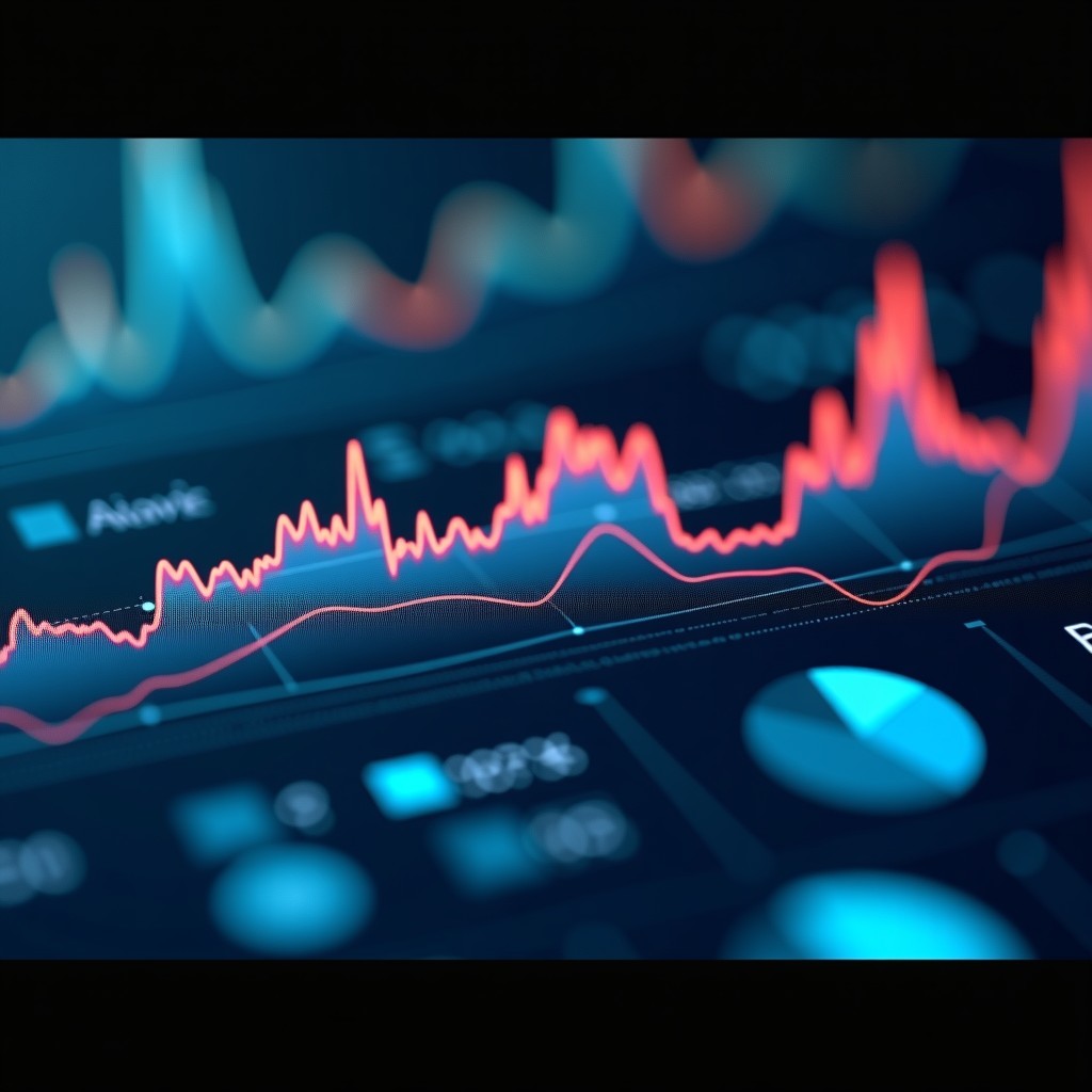
Consumers in India are increasingly savvy; they associate polished visuals with trust and status. A recent study on visual perception (see color theory) shows that warm, saturated tones can increase perceived luxury by up to 20 %. After handling multiple projects, we’ve observed that brands that skip professional grading often look like they’re using stock images, which erodes credibility.
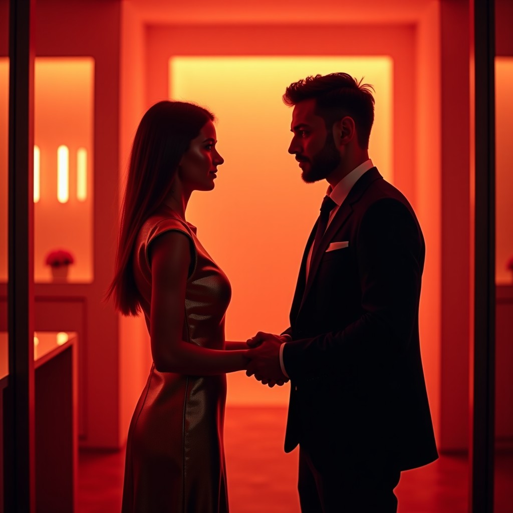
In Chennai’s fast‑growing retail sector, where new storefronts appear weekly, a differentiated visual language can be the deciding factor between a shopper walking in or scrolling past. Luxury perception isn’t just about price; it’s about the story your colors tell.
Our approach – Stack E Systems style
At Stack E Systems, we blend data‑driven insights with creative finesse. First, we analyze your audience’s color preferences using Google Analytics and heat‑map tools. Then, we craft a grading workflow that matches those insights. In our experience working with local Chennai restaurants, this method raised average order values by 15 % without changing the menu.
We also run A/B tests on landing pages, swapping graded versus non‑graded hero images. The graded versions consistently outperformed the originals in dwell time and click‑through rates, proving that the visual upgrade translates into measurable business results.
Practical tip for business owners
Start by selecting a single “brand hue” and apply it subtly across all images. Even a 5 % increase in saturation on key product shots can make a noticeable difference. Remember, consistency beats complexity; a uniform look builds trust faster than a kaleidoscope of colors.
Another quick win: use a soft vignette to draw the eye toward the focal point of the image. This technique is inexpensive, requires no extra software, and instantly adds a touch of sophistication.
Common mistakes to avoid
- DIY grading with free apps – the result often looks over‑processed and cheap compared to a professional workflow.
- Inconsistent color palettes across channels – this dilutes brand equity.
- Neglecting color calibration on monitors – what looks luxurious on one screen may appear dull on another.
- Relying on a single “trend” color without testing it against your audience.
In our experience, clients who tried to self‑grade ended up spending more time re‑editing and still fell short of the luxury feel they wanted. The hidden cost of re‑work often outweighs the upfront investment in a professional grade.
Why choose Stack E Systems
We combine local market knowledge of Chennai with global best practices. Unlike generic agencies that treat every client the same, we tailor each grading profile to your industry, target demographic, and cultural nuances. Our clients appreciate that we don’t just deliver pretty pictures; we deliver a strategic asset that drives higher‑margin sales.
Our team includes a color scientist, a senior photographer, and a conversion‑focused copywriter. This interdisciplinary mix ensures that every pixel supports your overall marketing funnel, from awareness to purchase.
Final verdict & call to action
If you’re ready to elevate your brand’s visual language and command premium pricing, let us handle the color grading for you. Contact us today to schedule a free visual audit and see how a few calibrated hues can transform your bottom line.
Learn how our lead‑funnel expertise can amplify the impact of your new luxury imagery.
Frequently Asked Questions
Q: How long does a color grading project take?
A: Typically 2–3 weeks for a full brand suite, depending on the number of assets.
Q: Will the graded images work on both web and print?
A: Yes, we deliver files in both RGB (for digital) and CMYK (for print) formats.
Q: Can I see a before‑and‑after preview?
A: Absolutely. We provide a side‑by‑side comparison so you can approve the luxury look before final delivery.
Q: Is color grading suitable for all industries?
A: While every brand benefits, it’s especially powerful for sectors where perception of quality matters—fashion, hospitality, automotive, and premium services.
Q: How do I maintain the graded look in future campaigns?
A: We hand over a detailed style guide and a master LUT file. As long as you apply the LUT to new images, consistency is guaranteed.